Funnel Chart — Suggested Alternatives
Similar to pie charts, funnel charts are another type of data visualization to be used with caution.
This article will discuss funnel charts, its issues, and my suggested alternatives, as well as quick videos on how to do it in my favorite data visualization tool- Tableau.
Funnel Chart Overview
Funnel chart (also called a funnel graph or funnel diagram) shows a flow of progressive reduction of a variable value along subsequent stages. Most often, it is used to visualize sales processes.
Funnel chart combines flow and part-to-whole chart types (the upper stage is always 100% and the following stages will be parts of it).
It has 2 main goals:
1. Visualize the quantitative size of the different stages and allow the user to see which Stage is bigger (and by how much)
2. Visualize the process as a whole- the shape of the funnel conveys the health of the process it’s tracking.
Classic Funnel
Funnel chart gets its name from its shape, which starts wide at the top and narrows at the bottom. In each stage, the width and/or thickness represent the number of subjects.
While some may say that it is visually appealing, it does not provide users maximum insight at a minimum of effort/time.
Why? It is difficult for our brains to distinguish between the sizes of different diagonal area shapes. Try to determine, based on the chart below, what percentage is the 3rd funnel stage (Qualified) out of the first funnel stage (Total leads)?

Most BI tools suggest the following out-of-the-box version, which is better, but it is still challenging for our minds to compare the sizes as they start from different points, resulting with unnecessary distraction:

Moreover, it is less appealing visually (IMO), which is important but not as important as visualizing data effectively, so I find this chart a lose-lose.
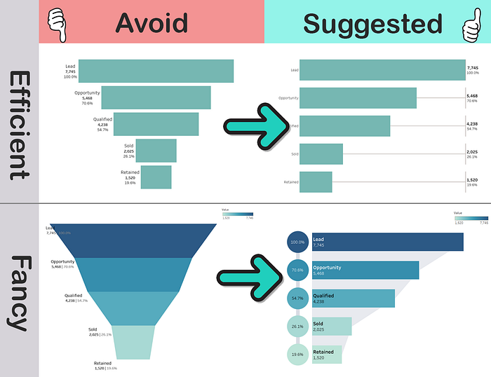
Suggested Alternatives
We will start with the example which delivers maximum insight with minimum effort, and it is based on a simple bar chart with part to a whole addition:

This one makes it much easier for our brain to compare the stages since they begin at the same point. The diagram also shows the basic structure of the entire process and conveys its health.
Here is a quick video of how to make that in Tableau:
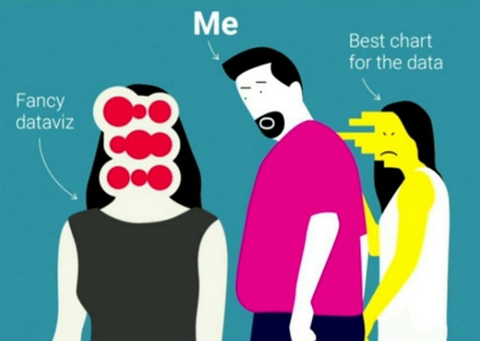
However, this funnel is sometimes hard to sell as it might seem “less sexy” to some customers and marketing focal points (based on my experience, not judging).
This brilliant meme can’t illustrate it more :-)
So after many iterations, my go-to alternative which satisfies both ends is this one:
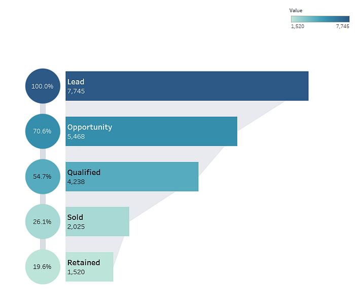
Here is a quick video of how to make that in Tableau:
To wrap this up:
Thanks for reading, share your thoughts!