Minecraft- Block Dist per Layer- The making
Let me start by saying, this is one of the vizzes I most enjoyed making mostly because it was a collaboration with my 10YO son, Itamar!
Itamar is really into Minecraft, while I am really into vizzing.
Isn’t it an excellent opportunity to leverage related data-set by the courtesy of the awesome #GamesNightViz project and have a quality time together around things we both love.
In This blog we will cover the process of making this viz + how-to for most of the more interesting widgets in it.
It is aimed for users with intermediate +- level in Tableau and includes some python code we used for data preparation.
1. The cycle of analytics
We will describe the steps we went through making this viz using the classic cycle of analytics (we several iterations):

1.1 Data Discovery
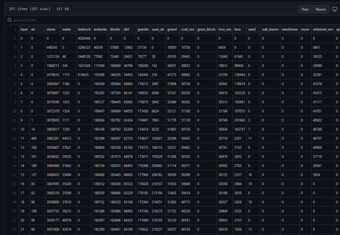
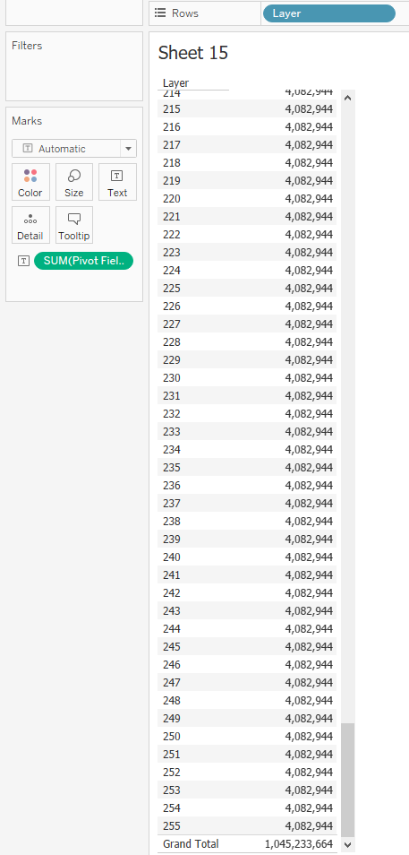
The source data is quite simple: 255 rows as the number of the game layers,
205 Columns as the number of blocks (materials or objects).
For each layer (row) and block (column) there is an aggregated value representing block frequency:
The challenge was to take this simple data-set and to create an interesting data story out of it and/or to visualize it in an appealing way.
1.2 Data Preparation (1)
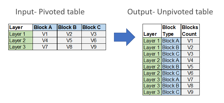
In order to enable us to work with the data more conveniently, the first thing we did is to unpivot the 205 columns (blocks) into rows over each layer.
I suggest following this approach when possible as it will allow more flexibility working with tableau:
1) Performance- usually, in my experience, tableau tends to favor more rows over more columns. In larger data sets, this could make a huge difference.
2) Flexibility- If you won’t unpivot the data you will need to work with measure names and measure values. doing so will bring some constraints as you won’t be able to use it within calculated fields, nor to apply advanced data manipulations such as general Level of Details calculations.
Luckily, Tableau allows you to unpivot the data easily from the data source pane by selecting all the relevant measures (205 columns in our case), clicking on one of them and selecting “Pivot” (I know it’s confusing as it should be “Unpivot” for that matter):
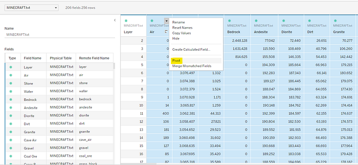
This will result in Pivot Fields and Pivot Values.
1.3 Data Analysis
The first important data insight is that the data is symmetric meaning for each one of the 255 layers there is the same number of blocks of ~4M, and with grand total of a ~1B blocks:
Using that knowledge we can easily create a perfect rectangle area chart (without using % of total table calculations),
And using Itamar’s Minecraft knowledge we can assign colors to resemble the native colors of the main block (sorted by the pivot values column):
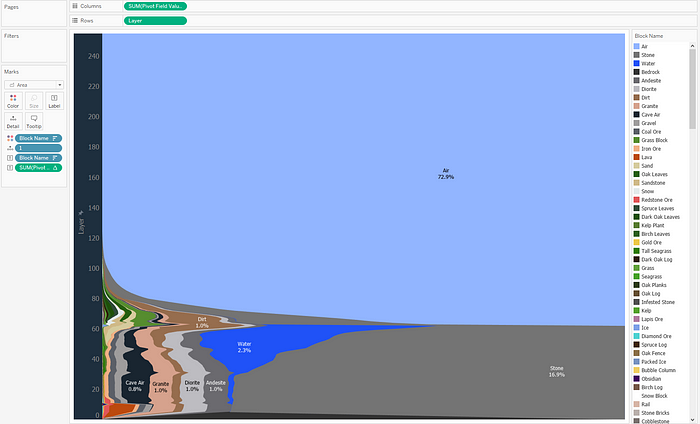
So now we have a second important data insight: out of 205 block types, there are only ~30 with significant visibility, with Air as the most dominant representing 73% of all Blocks.
1.4 Data Storytelling
We have come to the most challenging phase so far: again, the data is quite simple, we have 2 main points we discovered in the data analysis phase, and just nice area chart but we both feel this is not enough for an impactful viz.
Where do we go from here? we felt like we are stuck.
Along came Inspiration
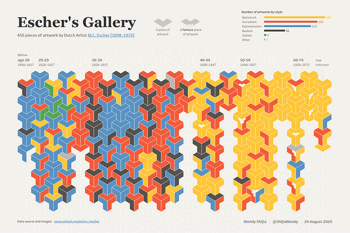
Then I remembered the amazing Wendy Shijia’s Iconic Data viz Escher’s Gallery showing intertwined:
I then thought, wouldn’t it be cool if we show the blocks one by one in their native 3d cube form?
2. Data Preparation (2)
As noted before, the data we have on hand is aggregated by block type and layer. In order to show the blocks one by one, we need to explode the data which means that if we have 14 Air blocks in layer 10,
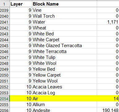
We need to explode it to 14 separate rows like that:
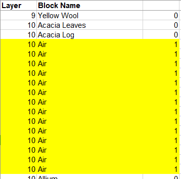
and then apply a different index, restarting after each layer to spread it uniquely over an axis.
Doing so will generate a huge matrix of
255 (layers) *4,082,944 (blocks)= 1,041,150,720 marks which is an overkill if we wish to show each block separately.
We have to think of a way to reduce the amount of data before we explode it.
the first step is to normalize the data to be large enough to represent the source data and show main block types and small enough to be presentable.
After many iterations, we figured that having 450 blocks per layer (instead of 4M) will be optimal. so eventually we will reduce the data amount by almost 10000 times
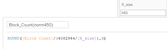
Doing so keeps only 34 block types (out of 205) but these core 34 block types represent 99.9% of the total amount of blocks (1B) so we feel it does represent the data well.
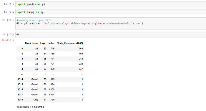
Now we are ready to explode the data. I chose to use Pandas package in Python, but there are many other ways to do that.
2.1 Preparing the input file (Tableau)
The input file we will throw into Python will be based on the following cross-tab, showing normalized block count per type and layer.
We will export to a csv file: (minecraft_1K.csv)

We use this cross-tab as an input, explode it and create Row Number Index (RN) by each block for each layer (1 to 450 indexes for each layer).
2.2 import pandas and numpy libraries, read the input file (Python):
2.3 exploding the data:
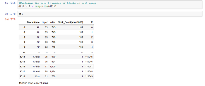
2.4 Generating a row number (RN) for each block type, restarting on each layer, and exporting the file
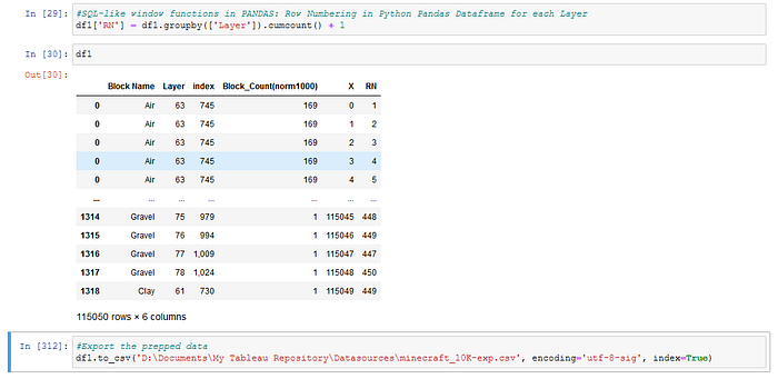
So no we have 255 Layers * 450 blocks = 115,055 marks

3. Data visualization
The real fun begins! The goal is to create a matrix of 115,055 shapes arranged by layers and block types. The block types sort order within each layer was determined in section 2.1 when we prepared the input file for tableau and sorted the block types manually by the desired order of appearance.
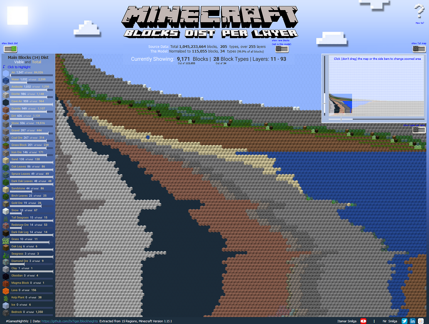
3.1 The main Grid:
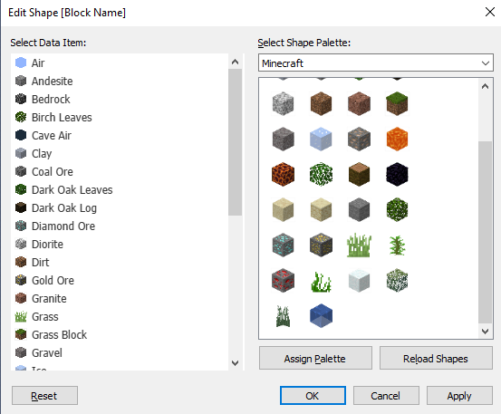
We downloaded 34 3d block shapes from Minecraft, cleaned them with Photoshop, uploaded to tableau repository shapes folder and matched them to the block types:
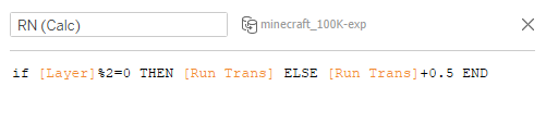
As you can see, the shapes are in a hexagon form. In order to achieve prefect interweaving we need to move each 2nd line a bit to the side to allow the hexagon fit perfectly with no white space.
We can do that by creating a new RN (Calc) field that adds 0.5 to each even layer:
Putting it all together will end up like this:
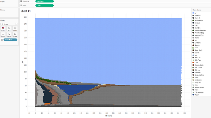
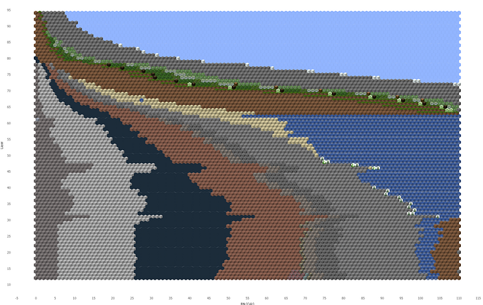
You can see the shapes are barely visible and not much different than the original view presented in section 1.3 above.
We need to zoom in order to make he effect of the 3d shapes visible!
We found (after several iterations) that the idle grid size should be around 100x100. to implement it we created a range filter based on 2 parameters for the blocks (columns) and 2 parameters for layers (rows) to determine the range start and end:
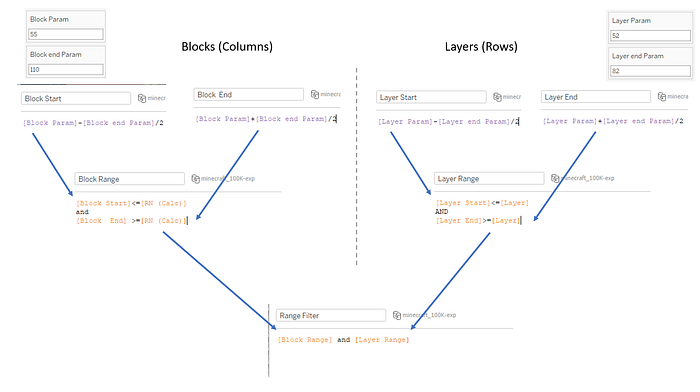
When applying the filter and increasing the shape size the grid now look like this:
* In the final viz I used map layers to show this grid but the simple version described above is at “Simple Zoomed Window for blog” sheet when you download the viz from tableau public: link
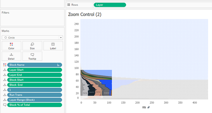
3.2 The zoom control widget:
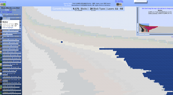
Now we have a zoomed window, which doesn’t show the full layout.
We wish to create a zoom control widget that shows the entire layout faded out and a distinct highlighted window of the zoomed area:
To achieve that we used:
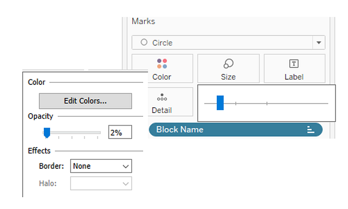
background picture similar to what we showed on section 1.3 (just sorted differently), 4 reference lines, 2 for the blocks and 2 for the layers with white fill above the end point and below the start point of the zoomed area:

We used a small size circle grid, using the shapes colors with minimal opacity to create the faded effect for the non zoomed area :
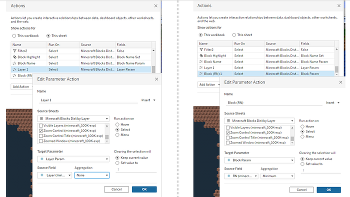
We can start assembling the dashboard now, placing the zoom control widget next to the main grid, and apply some parameter actions (my favorite tableau feature) to make it change the zoomed grid upon selection:
These are really the basic views of this viz. There are more features we added later on, I will mention it shortly but won’t get into much details
3.3 additional views:
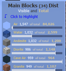
On-top of that we added a side view of the 34 blocks we visualized in the main grid showing the visible zoomed blocks as portion of the total blocks in this model — I used Andy Kriebel’s technique to show labels on top of horizontal bars : link
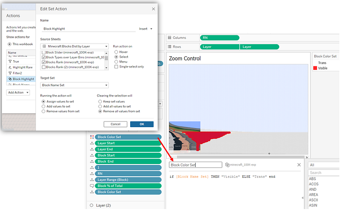
We used this view to add interactivity, allowing to click on a block and highlight it on the main grid and on the zoom control widget:
This was done by adding an axis to create a additional layer using dual axis, to the zoom control widget, using set actions to color the selected blocks, and using Transparent color for the rest of the blocks.
I learnt about transparent colors recently from Kevin Flerlage post: link
and its really cool and useful!
The last view I would like to mention here is the rare blocks:
You remember that for the main grid model we used 34 block types out of total 205. So what about the other 171 block types?
We thought they were worth mentioning too.
After quite a tedious job of downloading and matching the shapes (2D this time), We grouped them into 4 groups of appearance frequency,
and added a view underneath to show the blocks type count per layer (grouped by 2 layers):
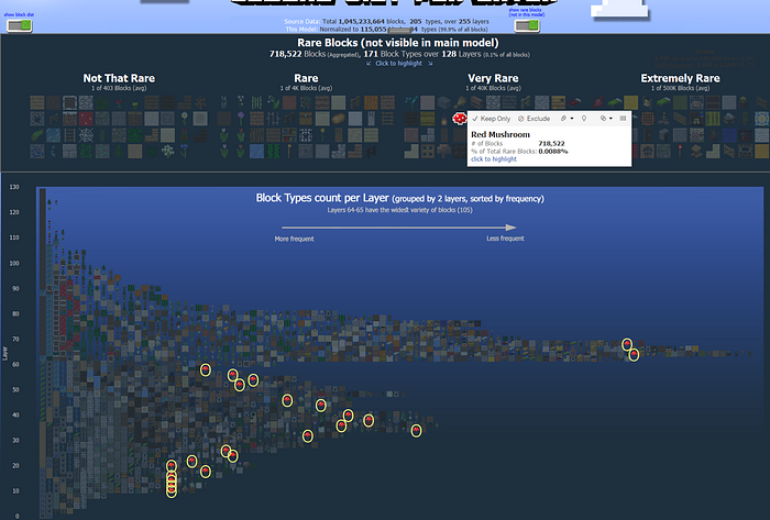
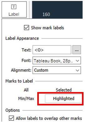
You can click on one of the shapes to highlight it and see its distribution over the layers. To do that we simply created Label with “O” text, and chose to show only when highlighted
That’s it!
We could write more but I believe we covered most of the stuff, and this blog has turned out to be longer than we intended :-)
We really hope you enjoyed reading it and had at least one takeaway to enhance your tool box.
If there are any questions feel free comment here to reach out via Twitter or LinkedIn
Thanks for reading!
Itamar and Nir
